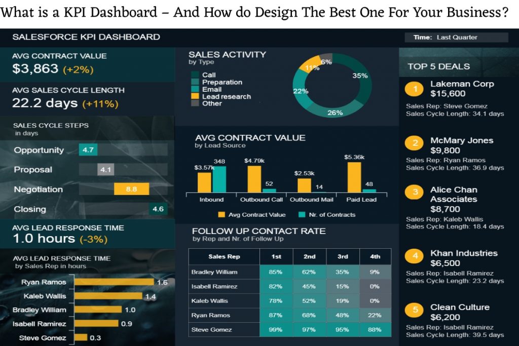
What is a KPI Dashboard?
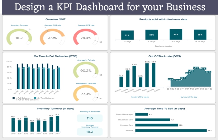
A KPI dashboard is a simple visual display of the most important information that decision-makers need to help them achieve their goals. When you’re driving your car, a glance at the instruments, dials, and gauges on your dash can tell you everything you need to know about whether or not you’ll get to your destination on time and in one piece; you can know immediately if you have enough fuel, how fast you are going and if the engine is well suited to your driving. Cars also come with warning lights that flash or turn red when your car is in trouble or needs service. A performance dashboard should do the same for your business.
KPI dashboard best view from an operational and strategic perspective. An operational dashboard allows you to check your business processes and daily results to make sure everything is going smoothly. Provides information that helps you solve problems before they become problems and affect performance. An example could include a call centre KPI dashboard showing the number of calls, average wait time, etc.
Your strategy dashboard, on the other hand, looks to the future and seeks to identify obstacles and challenges you may face on the way to achieving your strategic goals, such as profit projections, business growth, market share, etc. Both types are important to the success of the business.
A good KPI dashboard gives decision-makers quick access to critical business metrics or instruments and helps them decide whether or not they are on the right track. Unfortunately, some KPI dashboards prioritize style over utility or are so cluttered with detail that important information is impossible to decipher. Designing a good KPI dashboard requires careful thought.
How to Design a KPI Dashboard for your Business?

In a hectic business environment, managers and decision-makers bombard information daily. Therefore, a KPI dashboard that aggregates all critical data in one place is an extremely useful tool. At a glance, users should be able to know exactly where they are and what to do. Here are five tips for designing a dashboard that delivers on that promise:
1. Keep your dashboard on one screen or one page. The goal of a KPI dashboard is for you to get a quick, concise overview of the business and potential red flags. This is a snapshot, so don’t include excessive detail. If it takes you half a day to go through your dashboard, then it’s not a dashboard.
2. Include only the most critical and relevant KPIs needed to achieve your strategic and operational goals. Forcing yourself to stick to a single screen or single page helps with this as it will allow you to focus on the most important information the user needs.
3. Choose an appropriate and accessible way to display the table. For example, if you are using software, make sure everyone who needs the panel has access to the software.
4. Make the dashboard easy to see, navigate and understand. Don’t stack as much information as possible on a page, and organize the data aesthetically and logically.
5. Focus on disseminating and understanding information. Avoid over-design and don’t introduce insane variety to make the panel more exciting. Likewise, don’t include decoration or excessive use of color – everything in a KPI dashboard has a purpose, or it shouldn’t be there.
Using the KPI Dashboard Software

Several software solutions are available today, including those from major vendors such as Dundas, IBM, Microsoft, Oracle, Qlik, and Tableau. The software can be a great performance management tool, making it easy to report and communicate KPI data through automated dashboards. However, the keyword here is a facilitator. The software is not a total solution; you have yet to figure out exactly what you want the software to tell you. This means that to get the most out of any software tool, you should always do all the front-line work to design and develop the right KPIs for your business and put together the information you need to improve performance.
That said, the software can bring key performance indicators to life with powerful communication and collaboration capabilities. Visually rich, color-coded, and intuitive KPI dashboards can be created in minutes, so users can understand information at a glance and update it with the click of a button. In addition, most of the tools available today are web-based, which means that you can access the information through your Internet browser anywhere and anytime. Therefore, the software can greatly facilitate data processing, reporting, and ongoing communication.
Whichever option you choose for your KPI dashboard, the key is to display the key KPIs that will inform your decision-making. Business leaders and decision-makers don’t have time to sift through stacks of KPIs to find the most critical ones. By keeping your KPI dashboard clean, simple, and focused, you’ll be on the right track to make better decisions and improve your business performance.
Related Searches:
[kpi dashboard in excel]
[kpi dashboard example]
[kpi dashboard tableau]
[kpi dashboard full form]
[kpi dashboard free]
[kpi dashboard tools]
[kpi dashboard template]
[kpi dashboard meaning]


